


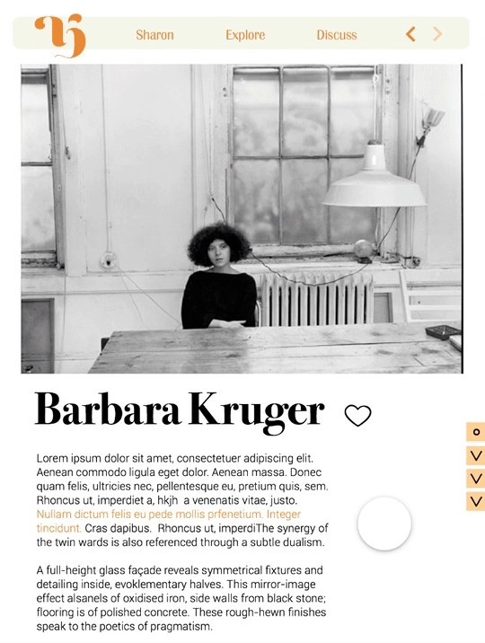
Taking a Dot for a Walk
This book is an exhibition catalogue for Taking a Dot for a Walk. Inspired by modern artist Paul Klee’s statement that “A line is a dot that went for a walk”, the exhibit’s theme illustrates the many ways in which artists have treated the most basic element of art – the line. The exhibit includes important works by artists such as Pablo Picasso, William Anastasi, Agnes Martin, Wassily Kadinksky, Sol Lewitt, and Ellsworth Kelly.
The line is one of the seven elements of art, along with shape, color, texture, form, value, and space. The immediate nature of making line drawings makes it raw and transparent. The exhibition aims to examine how the line manifests itself in a vast array of drawings. The selection of works will show different approaches made by the artists to creating image, meaning or emotion through the application of line to surface.Each artist's signature is also featured in the poster designs, as they are essentially making their mark with line drawings.

Radhika Kashyap is a UIUX designer based in Los Angeles, currently flexing her design and strategy muscles as a Graphic Design student at ArtCenter College of Design.
She also has a BFA in Illustration (checkout her Blog) from Singapore, where she is originally from.
She actively looks for gaps in the market that she can turn into design opportunities. She is a lover of good user-centered design that allows her to get creative with inventing new solutions. She is constantly working on personal projects to fulfill this desire (current personal project: UpCyclish).
By understanding and empathizing with the individuals she is designing for, she makes both visually beautiful & user-friendly designs. (favorite UI design right now: Annual Awwwards).


"Alexa, mute me"
Navigating through in-call
experiences
Worked on UX design


INTERACTION
Side anchors that takes you to desired section of the page.
FEEDBACK
Very useful since pages are lengthy.
Button targets should be bigger.
INTERACTION
Slide side anchor to the left to go to the next page.
FEEDBACK
Brings in an element of fun and discovery but it is not very intuitive.
Difficult to hit targets on such a small screen size.


Side Anchors


